faPrint Requirements for File Submission

Do not include crop marks.

Ensure your design size matches your print size. For example, if we receive a 4" x 6" file for an 8.5" x 11" product, we will stop your order and request a new file.

Convert all of your text to outlines. This will avoid an unintended font substitution.

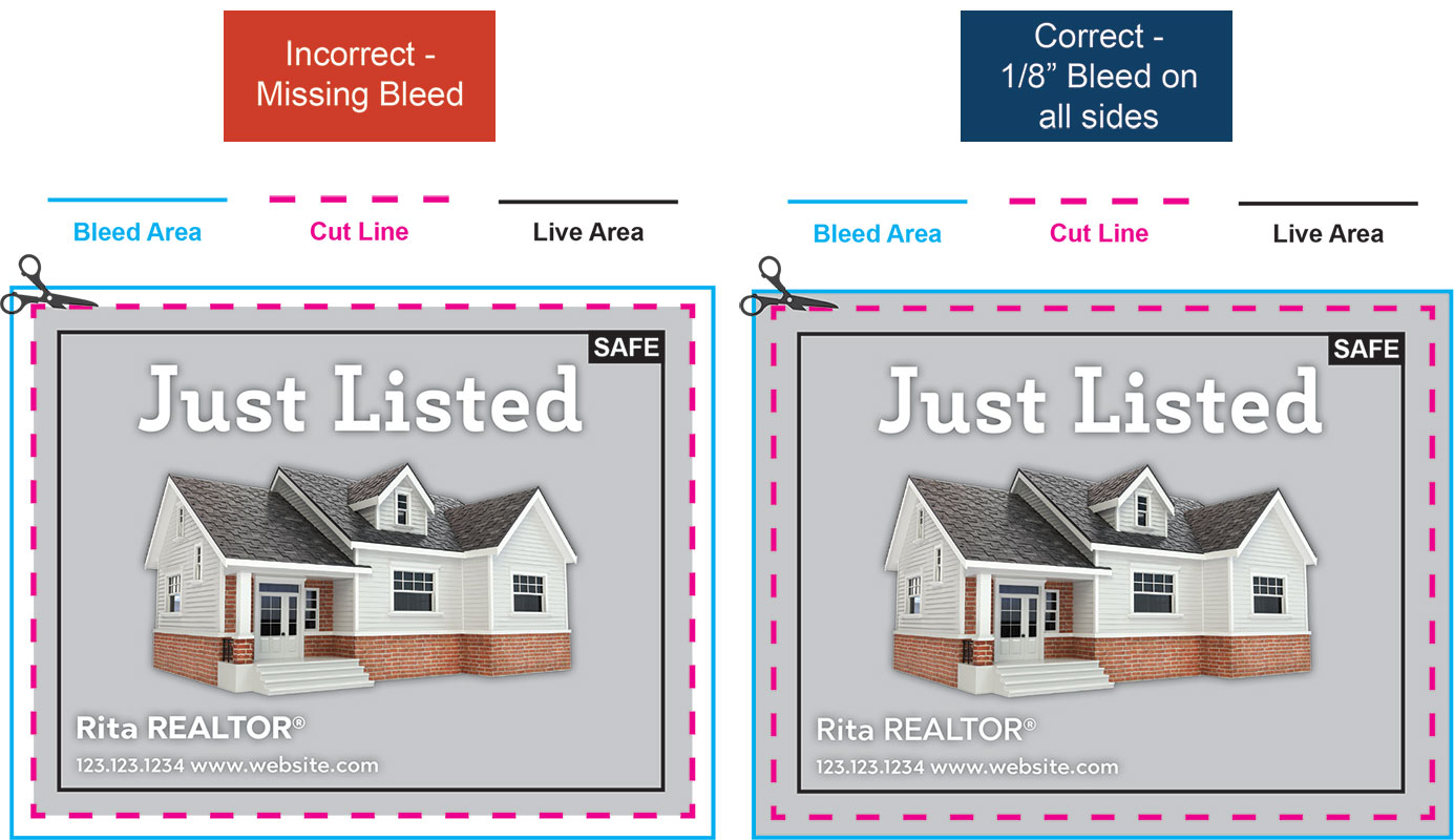
Bleeds are required in all artwork with an image or color extending to one of the borders. Add 1/8" (0.125") to each side to allow for cutting. For example, for an 8.5" x 11" flyer with full bleed, the image size should be submitted at 8.75" x 11.25".


1/8" (0.125") on each edge of the flyer will be trimmed off during the cutting process. This will leave you an 8.5" x 11" standard flyer.

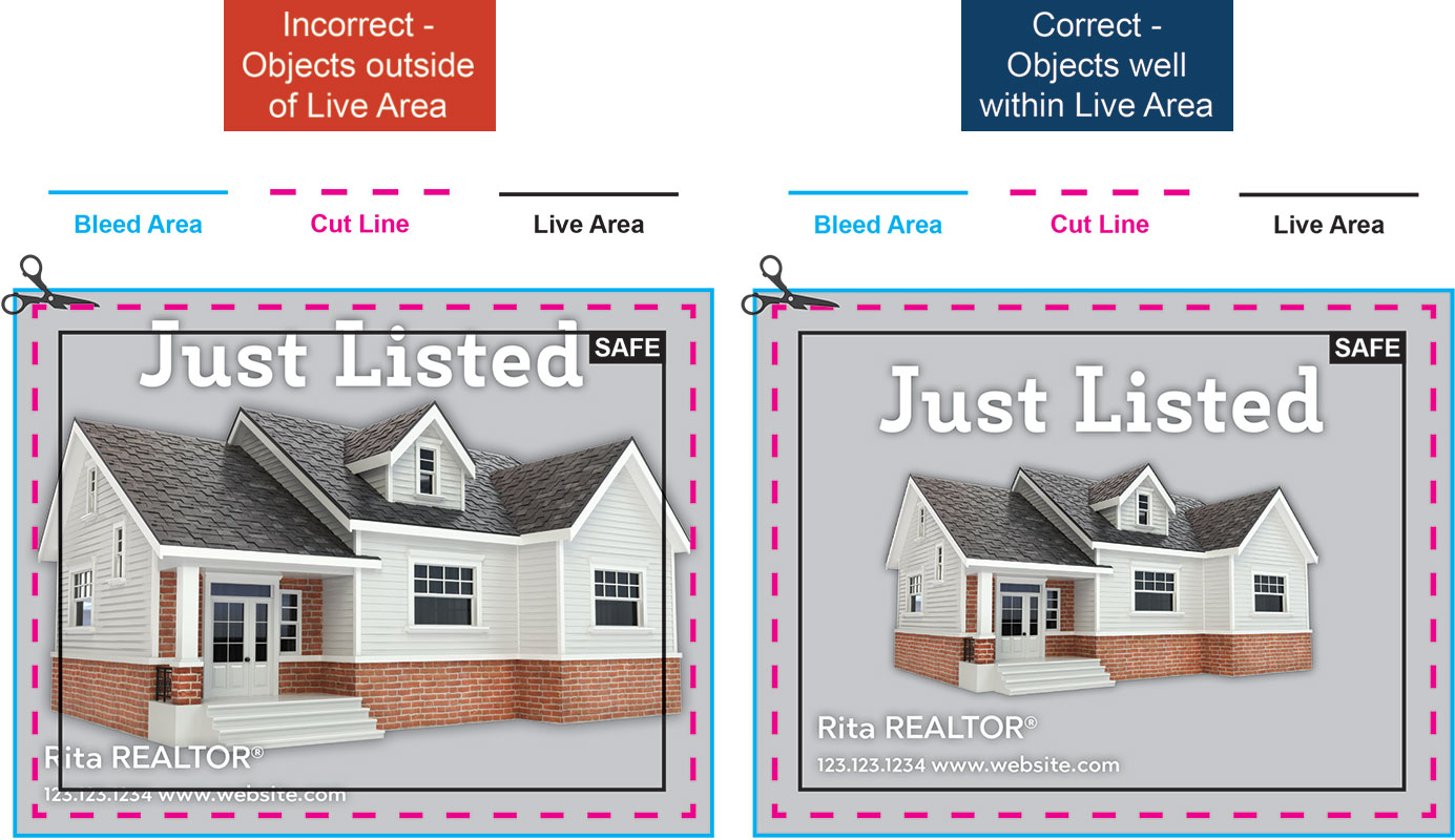
Maintain a 1/4" (0.25") safety margin from the cut line. This means all of your important content (websites, addresses, text etc) need to be at least 1/4" away from the edge of your print to ensure they will not get cut off during trimming.

If your file does not meet these requirements, we may halt your order and request updated files.
  We also reserve the right to cancel and refund any orders for files that are unprintable.

Tips for Creating Your Print-Your-Own File


Safety Margin


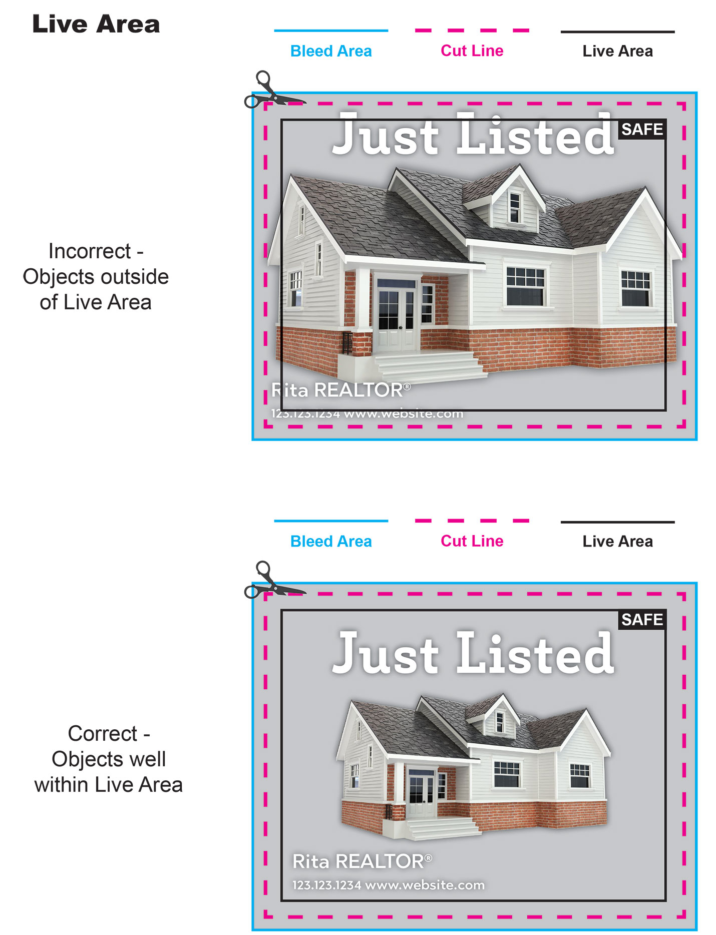
Every file should include a safety margin to make sure none of your important content is cut away.

Keep all of your critical text at least ½ away from the cut line.


Example:


Setting up Files for Full Bleeds


Does your design need to touch the edge of your final print?

If the answer is "yes", your file should include a bleed. It is not possible to print right to the edge of a piece of paper. Including a bleed means that you include extra space around the edge of your file and that your design extends to the edge of this extra space. When cutting the prints, we intentionally trim off the extra space, giving th appearance that the ink was printed to the edge of the paper. If your design does not include this extra space, we may attempt to stretch your design to fit, but that may result in distorted artwork or the loss of important information. It is better to keep all important content within ½ of the trim line and extend the design an extra ¼ beyond the trim line.


Example:


Graphics and Fonts


Digital designs can be unpredictable in print. While some issues can be anticipated and designed around, others may not be apparent until after printing. We strongly recommend ordering a hard copy proof to make sure all elements of your design appear as you intended when printed.

Image Resolution

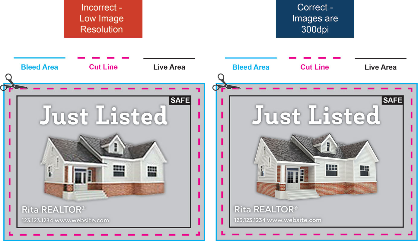
An important factor in print quality is the resolution of your images. The higher resolution the finer the detail in the print will be and sharper it will look. Printing an image with low resolution will likely be blurry and result in poor quality. Images that are saved off of a website are not suitable for printing. By using a larger, high-resolution image you are much more likely to have a crisp clear printed product. We recommend images be 300dpi.

Example:

Fonts

Ideally, all of your fonts should be outlined, or converted to an image or shape, prior to uploading your file. This avoids the possibility that the printer will not be able to read your font. When the printing software cannot read the font, it will automatically replace it with another font, causing the prints to look different. Some programs may not include options to outline fonts. These include programs that are not intended for graphic design, such as Word and PowerPoint. Even Publisher will not outline the fonts. Publisher will embed the font, which may help to achieve the same look you intended, but is not 100% reliable.

Overlapping graphics / Opacity / Gradient

Any of these techniques may be difficult to print as you envision. Layering may cause distorted images, blocks of color or missing text. Watermarks may appear too faint or too heavy. It is impossible to predict how these techniques will look in print. We highly recommend getting a hard copy proof on any designs that include these elements.


Improve Alignment


When cutting a stack of prints to their finished size, an unavoidable shift will occur. This is true in all print shops. Of course, we will minimize this shift as much as possible there are a few precautions you can take to minimize the impact on your prints.

Edit/remove design elements that can draw the eye to the shift.

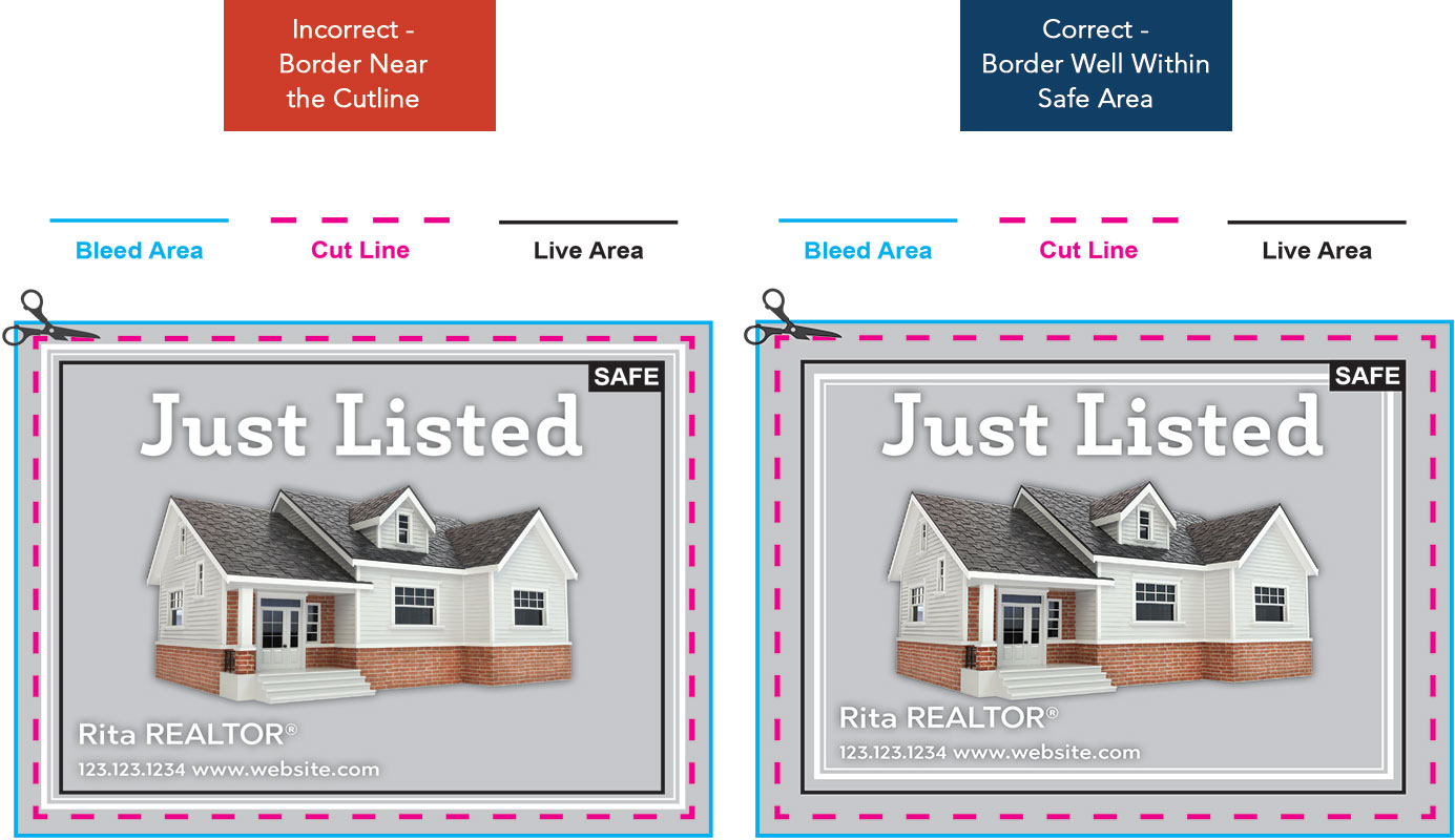
Edit or remove design elements that can draw the eye to the shift. If your design includes frames around the edge of your design, make them at least ¼ inside the cut line. In fact, all content including borders, lines and artwork that runs parallel to the file edge should be at least ¼ away from the cut line. While these precautions will not impact the actual cutting process, they will improve the appearance of final prints by balancing the shift.


Example:

Keep important content away from the cutline!

Any artwork or text that is designed too close to the cut line is at risk of being trimmed off of the final piece.

Please be sure that you keep a safety margin of at least ½ between your content and the cut line.